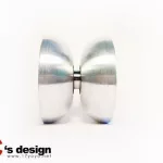
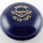
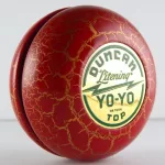
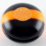
§ The hardware
Every throw catalogued.
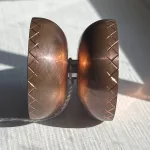
All products that have passed through the archive — unresponsive, responsive, fixed-axle. Filter by play style or material.
№
Product
Type
Material
Style

Product photos are sourced from manufacturer and brand storefronts, as well as retailer archives including YoYoExpert, YoYoSam, and Rewind. Images remain the property of their respective owners. If you are a rights holder and would like an image removed, please contact us.